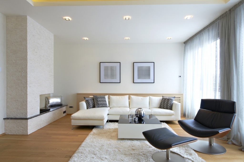
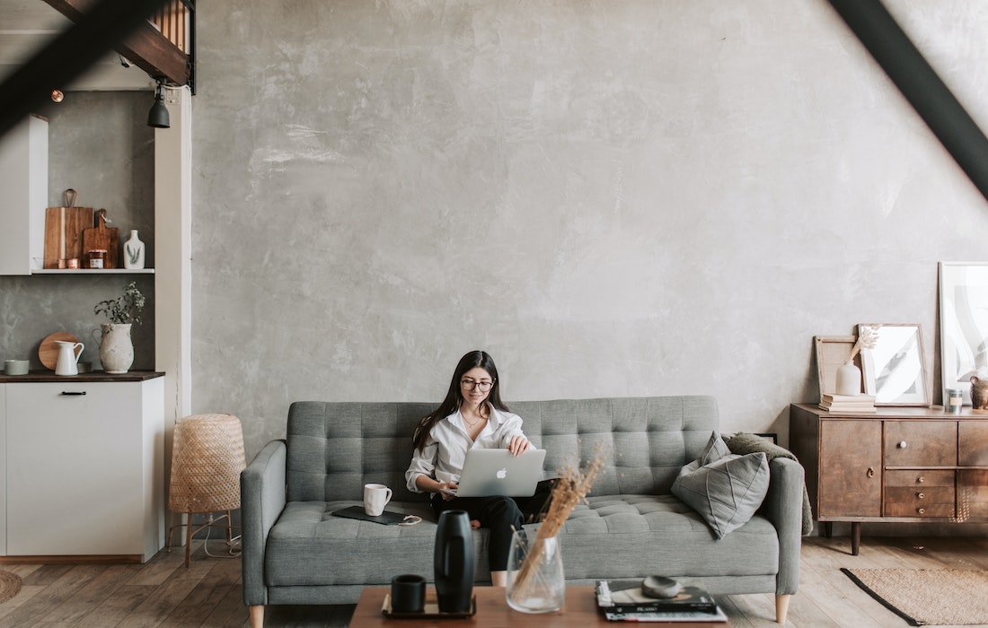
Minimalism is nice, clean, and simple, but it’s not for everyone. In fact, even though it has gone more popular in mainstream design, many homeowners are on the opposite route by going big and bold on their style — with maximalism.
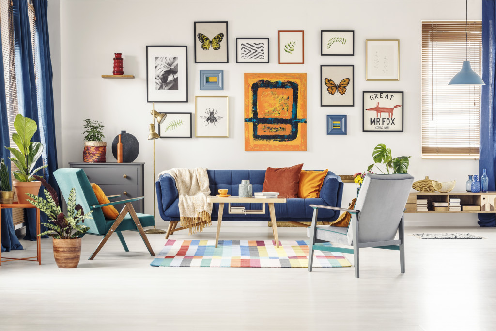
Homeowners are splashing lots of colors, layering textures here and there, and showing off graphic patterns on walls, floors, ceilings, and furniture. In the same manner that minimalism can go borderline boring and monotonous, maximalism can become borderline messed-up and sloppy. If you want to avoid that cluttered look and make maximalism work to your advantage, here are some design tactics you should use:
Build from the basics.
On the surface, maximalism feels like it’s just a random splash of colors, textures, or patterns. If you look at it closely, however, at least the ones that successfully worked are built on the basics.
Consider the hallmark characteristic of maximalist designs: a wall filled with many artworks. The pieces are in different frame sizes, placed in a disarranged layout, but still, it doesn’t look sloppy. The secret? Its backdrop.
The wall has a bold monochromatic color, which means that this wildly decorated gallery wall builds on a basic element. That’s why the whole thing doesn’t look cluttered. This is what you should do as well for the rest of your design, especially in fixtures and furniture. Start with the basics and pile up the other elements from there.
Follow a theme.
A theme is like a narrative helping the people entering the space make sense of every detail in your design. On your part as the one decorating, a theme in mind guides you in how you would choose elements to introduce in the space, instead of randomly picking any bold pattern or color.

For instance, you’re envisioning your living room to be a nature’s paradise. You can have an indoor water fountain or a koi pond as a focal point or a living wall as your accent wall. Of course, you cannot overlook the use of natural materials, like wood on your floors and ceilings.
The bottom line is to come up with a theme before filling the space with anything. Work with an interior decorator and ask for their advice. Utah-based specialists can give you theme options, allowing you to explore different “stories” for your space.
Choose elements that have something in common.
A maximalist style will not appear cluttered even though your furniture and fixtures are screaming in colors and patterns — as long as these colors and patterns belong to the same family.
For instance, a bold orange mixed with red and pink works better than when it’s blended with green and blue, simply because the former has a close resemblance to each other. In the same manner, a velvety texture matches well with silk and fur materials compared to wooden or steel finishes. The principle here is to select elements, which are almost alike. Find a subtle element that ties everything together.
With all its loud colors and bold patterns, the maximalist design can easily become too cluttered and sloppy. If you follow these design strategies, you’ll be able to avoid such and instead maximize the aesthetic rewards of maximalist style.


