Most people judge a car by the emblem seen on the front or on the steering wheel. After all, the logo isn’t just a symbol that represents the make of the vehicle; it represents the prestige associated with the brand. For businesses and marketers, it’s a significant tool for branding.
As a result, designers pay attention to the logo and often change it to go with the brand’s change of personality or to meet the market’s latest demands. One of the companies that have always focused on their emblem and continues to change it is Mazda.
Don’t believe us? Just check the evolution of the Mazda logo. It’s a long one, but if you’re brainstorming ways to create a logo of your own, take a leaf out of one of the most popular logos in the world (like Disney, Walmart and more).
Where Did Mazda Get Its Name and Logo?
The Japanese automobile brand is one of the few car brands whose car logo (with wings!) has changed with time. Despite the changes, the company stayed true to the inspiration of its name. Mazda is derived from Ahura Mazda, who is the god of wisdom, intelligence and harmony. Ahura refers to the God of Light while Mazda means wisdom. Light and wisdom are elements always visible in all of the Mazda emblems.
What Does Mazda’s Logo Mean?
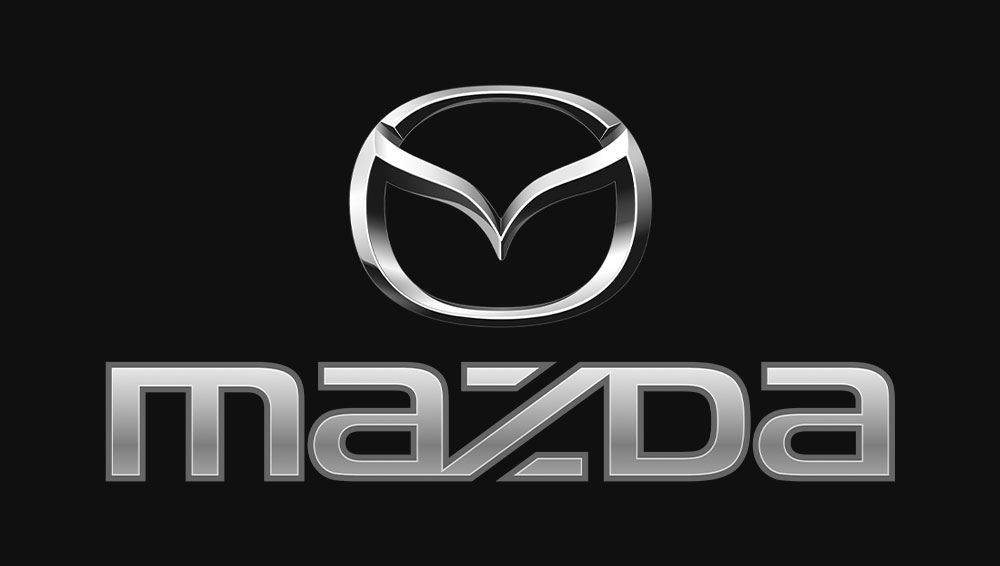
Mazda’s current logo is a wing-shaped letter “M” imposed over an oval. According to the car company, the emblem represents their continuous pursuit of improvements for the sake of powerful driving and growth. This is expressed by the pair of wings (which is also the “M” on the symbol) that also suggests the company’s flexible thinking, resilience, kindness, vitality and creativity.
Mazda is proud of its determination to stand up against impossible challenges to pursue its goal of innovation. Committed to creating cars with excellent quality (thanks to its advanced technology), the car company emphasizes its want to overcome challenges with its symbol.
What is the History of the Mazda Emblem?

1934 to 1954
The first logo appeared on all of their three-wheel trucks, which were developed during the 1930s. The original Mazda logo is the simplest of them all — just the name “Mazda” written in plain language. The company used this logo on its mini-trucks and tricycles.
April 1936 to July 1959
The second emblem registered by the company had an elegant design. The Latin version of the letter “M” is duplicated three times to represent the “Mazda Motor Manufacturer.” It also symbolizes the river flow of Hiroshima, the hometown of Mazda. The long side extensions of the symbol represent the wings for speed, agility and Mazda’s ability to soar to greater heights.
January 1951 to 1972
From the 50s till the 70s, Mazda used a traditional logo that consisted of three Japanese characters. The letters represented the new leadership of the company. Registered in 1951, the new logo was released in the same year that Tsuneji Matsuda, the son of Jujiro Matsuda (the second president of Mazda), took over the presidency and became the company’s third president.
1954 to 1974
By 1949, Mazda was starting to export three-well trucks to their overseas clients. Along with the expansion came the desire to create a logo for international customers. Unlike its predecessor, this Mazda emblem writes the name “Mazda” in an attractive font. The company first registered the logo in Taiwan in 1954. By 1959, the logo was registered in 21 countries.
1959 to 1974
During this period, Mazda had another emblem due to the growing popularity of its passenger cars. To represent its newfound fame in this arena, the created a logo that consisted of the letter ‘M’ with two extended ends. The logo was seen on the Mazda R360 coupe and other passenger vehicles.
1957 to 1977
The classic Mazda logo that set the stage for future Mazda emblems was adopted in 1975. The logo showed off the brand name in bold fonts. From 1957 to 1997, Mazda had five different logos and minute changes. In all of these logos, the letters are in small caps except for the letter “D.”
June 1997 to September 2015
The Mazda symbol of 1997 is the closest one to the current emblem. It had v-shaped wings inside, which represented improvement and growth. The name “Mazda” was written in blue and in bold letters. This emblem represented the company’s want to pursue innovations for the growth of the automobile industry.
October 2015 to Today
The company renewed its logo in 2015 and its new symbol represented Mazda’s pursuit of sophistication and higher quality developments. If you look at the company’s corporate mark, all letters (except the letter D) are written in lower cases. Mazda wanted to express its reliability and precision by aligning the bottom and top lines of its corporate symbol.
The Font and Color of the Modern Mazda Emblem
The most recent version of the Mazda’s symbol is composed of two elements: a stylized M that represents the Hiroshima River and the oval. Combine the two and you have one of the most successful and recognizable labels in the car industry.
The logo has a metallic sheen that makes it look 3D. The effect is emphasized by the shadows in the “M’s” lower part.
As for the color, Mazda’s logo is colored with several hues of silver and a few shades of black. The inscription below the logo is colored Mazda’s trademark blue, making it stand out.
Not Just a Logo — A Representation
Mazda’s logo is one of the company’s most important branding tools. It stands for the identity behind the business. Like the other car manufacturers in the business, Mazda’s symbol boasts of a long history that showcases just how much the business has grown in the last 100 years.
So, if there’s anything we learned from Mazda, your logo shouldn’t just represent your products; it should represent your mission, vision and other future goals.


