Undeniably one of the most celebrated and popular superheroes of all time, Spiderman has made his mark in pop culture with his comics, TV series and films. As Peter Parker’s story entered different superhero narratives, many people found themselves relating to his journey. It’s no wonder Marvel’s Spider Monkey has tons of fans who want to represent him through his merchandise — all of which have his iconic Spiderman logo.
Spidey’s symbol, which consists of a spider figure that transforms with every logo update, can be found on almost every type of merchandise: t-shirts, bags, shoes and even toys. The Spiderman emblem and costume became so popular that people who weren’t into his comics and films were still familiar with it.
Spiderman’s logo isn’t just branding material; the symbol plays an important role throughout his branding journey. So, if you’re a big fan of Peter Parker or want to take notes out of Marvel’s logo book, here’s everything you need to know about Spiderman and his ever-changing logo.
Who Designed the Spiderman Logo?
The Spiderman comics were the brainchild of comic-book writers Jack Kirby, Steve Ditko and Stan Lee. Before Peter Parker’s debut, the majority of the traditional comic superheroes were grown men that looked like demigods. Lee switched the gears by introducing a superhero who was more relatable and humanistic — a hero that would appeal to both adults and teens.
Marvel initially opposed the idea since they thought that a human-like superhero would not suit their brand of demigods. On top of this, some of the executives considered teenage superheroes as more of sidekicks or accomplices.
Despite the initial protests, Stan Lee launched Spiderman in the 1962 publication of the “Amazing Fantasy” series. Once Peter Parker stepped up to the stage, people loved him. His dual life and personality made his character more interesting and dynamic. He was introduced as a humble college student who lived with his Aunt May and Uncle Ben. The orphaned Parker was bitten by a spider that gave him the superpowers he has today.
Initially, Peter wanted to use his powers for money. However, the death of his uncle served as a turning point for him, which led to Peter Parker becoming the Spiderman who opposes crime.
What Does the Spiderman Logo Mean?
Spiderman’s logo reflects the unique skills and abilities of the spider. His powers were sixth sense, agility, extraordinary speed, web-slinging and climbing on steep surfaces. Visually, this image was represented by a black spider that also symbolized flexibility, mystery, strength and protection. The spider also symbolizes interconnection, balance, patience, wisdom, power and manifestation.
Design Elements of the Spiderman Emblem
Spiderman’s symbol covers his whole chest area and is prominent whenever he rips his shirt to rescue people. His logo demonstrates a sense of responsibility that comes with the great power bestowed upon Peter’s shoulders.
Shape: the logo features a spider that sits on a strong web background. This represents the origin of his powers, as well as his supernatural speed, strength and agility.
Color: the spider and the web are often black while the background is red. The red background symbolizes Spiderman’s alertness. However, there are versions that don’t follow this color scheme. The 1994 version of the hero had a white spider against a blue background while the earlier 1984 version had a white spider.
Font: Although there are times when it is hardly seen, the Spiderman font is often italicized. The wordmark varies from one work to another also.
The History of Spiderman’s Symbol

Spiderman made his first appearance in “Amazing Spiderman” in August 1962. Since then, the neighborhood-friendly Spiderman and his symbol have been seen in different Marvel Comics publications and media. Spiderman and his story became so popular that he appeared in different shows, movies and video games. And with each series, fans saw a new logo design that depicted the hero’s evolving character.
The First Spiderman Logo (1962)
The original Spiderman emblem featured a round eight-legged spider that Peter drew. Compared to the newer versions of the logo, the first one looked a bit cluttered and bulky. Considering that design technicalities during the ‘60s weren’t as refined as they are now, Ditko still succeeded in making a log that stuck with the younger audience.
Also, Spiderman’s original costume remains the most iconic out of all the Spiderman costumes. The blue and red color palette made Parker instantly recognizable against New York City’s dull concrete walls.
Romita’s Version (1966)
John Romita Sr. succeeded Ditko in 1966. He paved the way for a new era of Spiderman comics. He started by gifting the series with iconic characters like Mary Jane Watson, The Kingpin and Hobgoblin. As soon as worked on “The Amazing Spiderman,” he created a new version of the Spidey symbol, which strengthened his position at Marvel Studios.
The 1966 version of the Spiderman symbol featured a narrower spider that sat on Spiderman’s chest area. The font used for the logo was a soft version of sans-serif and featured yellow letters with red undersides.
1979-1985
After Romita’s version, fans were introduced to a new logo for their favorite hero. The lettering of the 1979 version had broader and more linear shapes. The words were written in white and outlined with red-orange lines.
1985 saw another massive change for Spidey’s emblem. The newer version introduced a slanted Spiderman lettering, which would be used for the next five years. The logo’s new proportions also gave the letters a 3D look. It also featured an orange color with yellow borders. To complete the look, a spider hangs over the letter M.
1994-2005
A revision was made to the Spiderman font and logo for the “Spiderman: The Animated Series.” The flatter-looking logo was upgraded to look more spider-like and mystical. The letters were also jagged, smeared and extended in red.
The Present Logo
Designed in 2005, the current Spiderman logo looks more advanced and professional since the designers focused on symmetry and clarity. The 2005 monochromatic logo comes with longer and more defined spider legs, as well as a darker color that showed Peter’s dark side.
The Evolution of the Spiderman Logo in the Films
Spiderman’s logo also changed after he released one movie after the other. Currently, three actors have taken on the mantel of the hero and each of them wore a different Spiderman emblem across his chest.
Tobey Maguire’s Spiderman Logo
Known as the first mainstream Spiderman, Maguire started the Spidey hype in 2002 with a spider that has a smaller body and sharp, claw-like legs. The spider looked more realistic and less cartoonish. He wore the same logo until the symbiote entered the scene.
His new black suit represented a change in Spiderman. The black spider now had twisted front legs, which symbolized the hero’s dissent to twisted aggression.
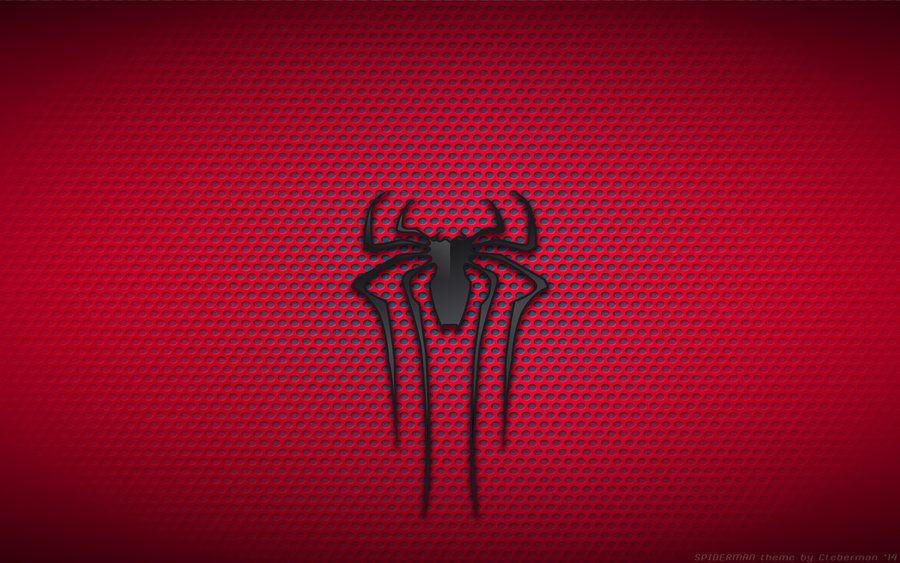
Andrew Garfield’s Spiderman Logo
Garfield succeeded Maguire and added a new flavor to the character. His portrayal of Spiderman also meant a new costume, which was decked with a spider that had elaborately long legs. Similar to Maguire’s, his spider also had a more realistic look.
Tom Holland’s Spiderman Logo
The latest actor to take up the role wore a suit that had a simple and short-limbed spider emblem. Holland’s classic suit, however, changes into an iron one that has a spider with a larger body and larger limbs (as seen in “Spiderman: No Way Home”). The gold outline and angular design give the symbol a more mechanical and modern look.
Throughout his existence, Spiderman’s symbol has changed with him. Some changes were made due to ownership while others were made to suit the character. Either way, the evolution of his logo paid homage to the hard work of the Marvel artists in developing an iconic character like Spiderman.