When it comes to advertising and marketing, your logo is typically the first thing a potential customer notices about your business. It does more than just serve as a profile photo for your social media accounts or email address, it’s arguably the most important part of your branding and is generally what your customers associate with you.
As with any other aspect of design, logos also go through different trends and styles, and 2020 was no different. With a new year coming upon us, we’re sure you’re just as eager as we are to see what trends are staying strong in 2021, and which ones you can kiss goodbye.
Minimalism
This trend has been at the top of the list for many years and it doesn’t look like it’s going away anytime soon. The minimalism trend in logo design has hit many brands hard, with businesses including Facebook, Intel, and Burberry opting to switch out their 3D logos for flatter, more basic ones. So basic, in fact, that the minimalism trend has gotten the moniker blanding in many design circles.
Although many top brands have gone the minimalist route, minimalism has also drawn polarizing opinions from designers, as many of them feel like logos now all look the same and strip brands of their personalities.
If you’re going for the minimalist way, keep these in mind.
![]()
Unusual fonts
On the other end of the spectrum lay logos made with unusual fonts. Think artistic serifs, handwritten typefaces, doodles, and more. The idea here is to catch the customer’s eye as quickly as possible with the unique and never-be-seen font. Finding a font that stays legible in different sizes can be tricky, though.
Hand-drawn imagery
Because minimalist and stiff, modern logos have been in-trend since the start of the digital age, logos made by hand tend to stand out and gain more attention. Customers appreciate the intricacy of these hand-drawn logos and all the effort that has gone into making them. We predict an even stronger resurgence of these logos in 2021.
Hand-drawn logos don’t need to be strictly drawn by hand. You can mimic the same look and feel of these vintage style logos on your computer using your chosen design software.

Overlapping text
Typography logos have always been popular in logo design, with many businesses opting to have the brand’s name as the logo itself instead of a symbol or shape to represent it. While easy enough to execute, this does not leave a lot of room to work your creative muscles.
Lately, typography logos made with serif fonts have been all the rage and it looks like we’ll be seeing a lot more of them in 2021, albeit with a slight twist. We predict more logos will be made with overlapping serif text, which makes the logo more fun and interesting.
According to Vered Bloch, Creative Designer for EditorX,
“An interesting trend which has developed this year in the typographic design world is the return of serif fonts to our lives. The trend intensified across all media – especially in web design, and eventually entered into logo design. Overlapping texts – putting one letter above the other – creates a captivating variation of using serif fonts in logotype, leading to new interpretations about the brand.”
Unique arrangement
Finding a creative and artistic way to position your logo elements is a great way to catch and hold your customer’s attention. Forget about keeping all of your elements in a straight line that either goes up and down or left to right. 2021 is all about pushing the creative barrier and seeing how you can stand out. Try arranging your elements in an S-curve or diagonally. Fit them outside your block of color instead of within it.
Make use of emojis
Whether you like it or not, emojis have now more or less become a part of our modern alphabet. Language is ever evolving and as we change with the times, so does our syntax and grammar. Emojis are a testament to the digitization of the human language, and many designers and brands have embraced this by incorporating an emoji or two into their logo. The great news is, there are over 3,300 emojis (and counting!) so there is no shortage of emojis you can choose for your brand. Things like the peace or victory sign, grinning face, hearts, and animals can easily be incorporated into a variety of business logos.

Analogous color schemes
This is a logo design often reported by the printers from CMYK.PH. In design speak, analogous colors refer to those that sit next to each other on the color wheel. In the past, we were taught to go for bold, contrasting colors but now, we predict a more subdued color palette.
If you want to apply an analogous color scheme to your logo, choose a primary brand color as your main color and use a less saturated version of the neighboring two colors to serve as the highlight colors.
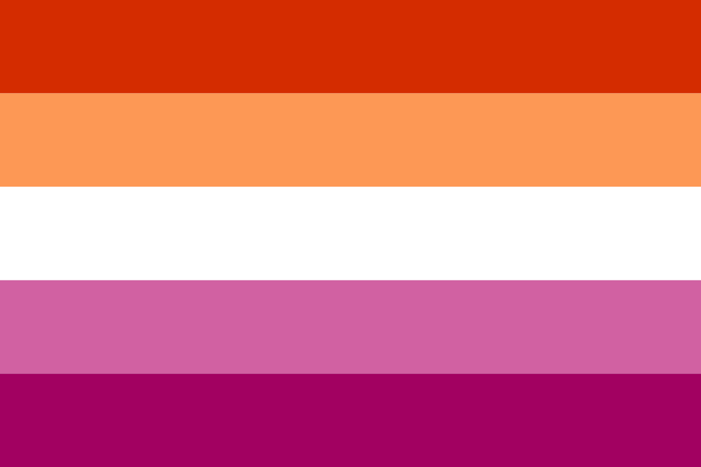
For example, if you want to have a red logo, you can use lighter hues of pink and orange to complete your analogous palette. This gives your logo and branding a harmonious and cohesive look.
In conclusion
Your logo is a representation of your brand and you should take great care when it comes to crafting one. It goes into every aspect of your branding and marketing collaterals and is what your customers remember you by. Whether you’re making a logo from scratch or redesigning your current one, keep in mind these 7 logo trends that will be making waves in 2021.


