Big box retailers are everywhere. If you drive to any populated city, any state, you’ll most likely drive by Kohl’s, Home Depot, Target or any other chain that guarantees that they have what you need. However, there’s one retail chain that has stood the test of time and continues to stand out from the rest — Walmart.
Currently, Walmart has a net worth of $429.337 billion and has branches all over the United States and some parts of the world. The brand is responsible for many organizations and sub-brands like Moosejaw and Bare Necessities.
Over the years, the retail giant has built a powerful reputation for having something for everyone (and at reasonable prices). Part of its reputation is the Walmart logo, which is one of the most memorable images in the history of branding. Simple yet effective, the iconic Walmart logo has become a symbol for community and value.
What was the Original Walmart Logo?
So, where did the Walmart logo come from?
Founder Sam Walton started the business in 1962. In 1969, the company was incorporated. Unlike Target and other retailers, Walmart’s icon evolved over the years.
The old Walmart logo had a basic design. Back then, Walmart was named Wal-mart. The old icon was simple and straightforward, which worked for a couple of years. Walton eventually decided to add a small star for decoration. The color palette was basic, too — just white letters on a red shield. It was accompanied by the old Walmart slogan: “Always low prices.”
Over the years, the company’s branding team has experimented with separating the “Wal” and “Mart” of the name, placing either an asterisk or a hyphen between the words. They’ve also worked with several versions of typography, but Walmart is best known for their traditional, sans-serif fonts.
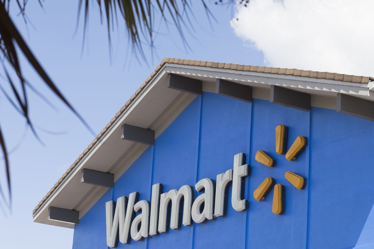
Walmart has also used different colors since they first released the original logo. They started with black to white until they changed to an earthy brown and eventually, the darker shade of blue everyone knows. Today, the Walmart logo has been changed to a softer blue color for a friendlier look.
The Evolution of the Walmart Logo
Between 1962 and 1965, Walmart didn’t have a traditional symbol or logo. They used their name written in a blue sans-serif font. By 1964, however, the company’s branding team started exploring more.
1964-1961
Walmart had different logos during this time. Some of the newer logos used a new serif font that looked Western. Walmart would end up using a ‘Frontier font’ on and off for the next two decades. During these years, the words “Wal” and “Mart” were separated with a hyphen.
Walmart also used an emblem-style design, which was often paired with the “We sell for less” slogan and “Satisfaction Guaranteed” promise at the bottom. Underneath the Walmart name, you’d see the words “Discount City.” This was eventually removed.
The branding team then overhauled the logo with a more weathered- and rustic-looking typography. Eventually, they tried a black Walmart logo design that placed all of the letters in the boxes, which gave the icon a more modern feel.
1970 – 1980
During the 1970s, the Walmart logos used the Frontier font again. The branding team re-used the blue color since blue is seen as a more appealing color to customers.
1981 – 1992
By 1981, Walmart did another major logo design overhaul as the branding team preferred a simpler letting. The all-caps font returned, although this time the designers made them a little bolder. The Walmart icon was colored brown again to maintain its rustic charm.
By 1992, Walmart changed the hyphen separating the “Wal” and “Mart.” Instead of a hyphen, they used a star. The logo is still present in some states today. In terms of the color, the branding team switched from brown to dark blue.
2008
During this year, Walmart’s logo faced another design overhaul. This time, the logo’s font was completely changed. All of the letters (apart from the “W”) were now in lowercase and the gap between the words was no longer there.
The branding team replaced the angular and heavy typography with a softer and more modern-looking typography. The dark blue became a lighter blue, which gave the new Walmart logo a more youthful and happier feel. Although the company removed the star in the center of the name, they added a “Spark” at the end.
Why Did Walmart Change Their Logo?
The constant change in logos was not without reason. Walmart has always believed that its changes in the logo are a reflection of the new image of its stores. Walmart also considers logo updates as its way of renewing its sense of purpose in helping shoppers save their money so “they can live better.”
What Does the Walmart Logo Symbolize?
Most of Walmart’s logos focused on the company’s name. After all, the name “Walmart” is one of the most memorable parts of the retail giant. However, the appearance of the Walmart spark in the early 2000s started to draw attention to the appearance of the logo itself.
Today, Walmart’s spark is a great representation of what the business stands for. While it isn’t as rustic as the old Walmart logos were, the spark is a more modern and customer-friendly icon. After all, shoppers are no longer looking for all-American companies. They want a company that inspires, which is what Walmart wants. The spark symbolizes inspiration and innovation.
On top of that, the company’s old image was a bit tainted due to shoppers associating their brand with low-class items or cheaper products. Designing a new logo was a prominent part of Walmart’s strategy to refresh its image. Logo changes are, after all, effective at helping brands improve their images.
The Walmart Logo: A Timeless and Inspiring Logo
The Walmart icon has had a long journey — a memorable one. Its logo today is a far cry from its old logo in 1962. Walmart ditched the “Frontier” brown logo to make way for lowercase lettering typography colored in soft and friendly blue.
Overall, the latest Walmart logo looks more informal and playful, which is similar to the logos of today’s leading brands. The retail giant continues to stand out from its competitors by providing a warmer and friendlier service, as portrayed by its current logo.