Star Wars is forever embedded in pop culture. Even if you haven’t watched any of the films, you’re familiar with “Luke, I am your father.” The trailer for the latest Star Wars film The Last Jedi currently has 57 million views on YouTube. With Disney+ offering a platform to expand the Star Wars universe, fans are gifted with many TV series centered on the galactic universe — The Mandalorian, Andor, Bad Batch and the highly anticipated Obi-Wan Kenobi (which is the most-watched Disney+ original series as of writing).
With all of these in mind, it’s safe to say that Star Wars isn’t going away soon. And neither will its logos.
The Star Wars logo is a representation of the saga’s evolution. The franchise has been around for more than four decades; naturally, it evolved to keep up with the changing times. While in most Star Wars films, the Republic’s logo might stay the same, the primary logo of the films do not. What worked in the 70s might not work today.
The iconic Star Wars logo has gone through a long journey (like any popular logo). So, grab some popcorn and let’s journey to a galaxy far, far away and look back at its history.
The Evolution of the Star Wars Logo
There was no Star Wars logo when the first film came out in 1977. Posters, advertisements and other marketing materials revealed subtle differences in the logo’s basic theme (plain and jarring text). But all the films that followed the first Star Wars movie had different versions of the original logo. Some logos featured a thinner style of writing while others were bolder and darker.
The Original Star Wars Trilogy Logos

Younger audiences might not realize that the original title of the first Star Wars film was just Star Wars. It wasn’t Star Wars Episode IV: A New Hope back then. It wasn’t until the film’s re-release in 1981 that it received the subtitle A New Hope.
In fact, the oldest Star Wars logo used the title The Star Wars during the pre-production phase of the film. As the movie transitioned into production, concept artist Ralph McQuarrie and his team created different versions of the logo until they settled on a logo created by typographer Dan Perri.
Perri’s version wasn’t particularly ‘sci-fi,’ but its yellow font was striking and bold, which was ideal for a series that seemed more like a fantasy film. The tapered top of the original logo went well with the opening crawl Star Wars is known for. His version would end up on the film’s first poster but not on the final film.
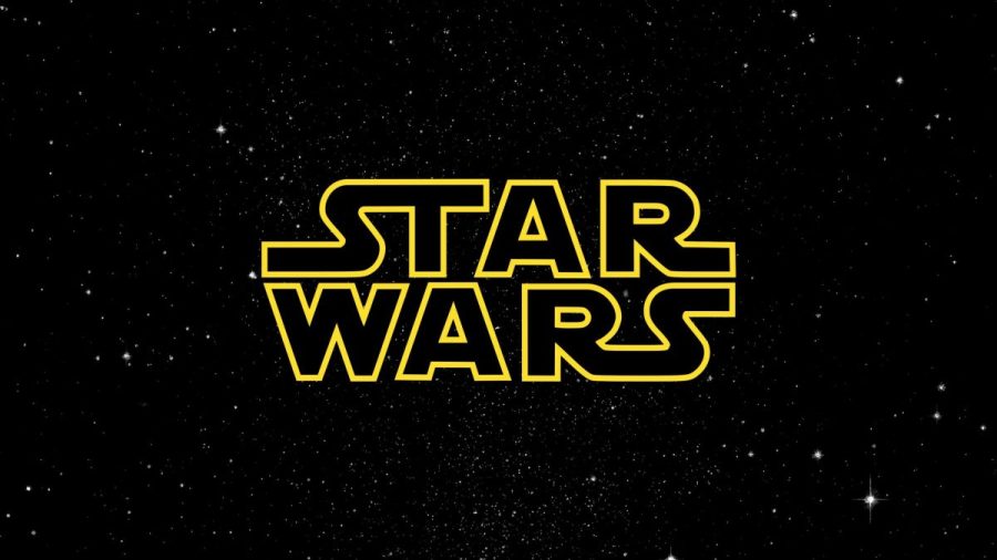
The final title logo that appears in the movie was designed by Suzy Rice (which was slightly modified by Joe Johnston). Star Wars creator George Lucas wanted a logo that looked more “fascist.” Coincidentally, Rice had been studying German signage design techniques (harsh lines, bold standardized font and severe graphics). She used her knowledge of these techniques to create one of the most popular logos we know today.
The second Star Wars film (aka one of the most anticipated sequels in cinema history) used the subtitle “Episode V: The Empire Strikes Back” but the creative team at the studio refused to add a number to the logo and poster itself.
Unlike the original Star Wars logo, the Empire Strikes Back logo doesn’t look too fascist. The angled text gave the logo a more adventurous feel while the chunky letters and sharp angles matched the sci-fi aspect of the films. There was an emphasis on the word “Empire,” ensuring that audiences would know what the movie was about.
Finally, Return of the Jedi, the third installment of the original trilogy, hit the theaters with yet another take on the Star Wars logo. Originally, the film was to be called Revenge of the Jedi. However, the studio executives realized the title sounded similar to another sci-fi film Star Trek II: Vengeance of Khan.
Compared to the Empire Strikes Back logo, the newer logo looked a bit ‘basic.’ Fortunately, the designers did shake things up by changing the color from yellow to white to red. The color change evoked an ominous feeling.
The Prequel Trilogy Logos

The original trilogy’s logos always emphasized the movie’s title. In general, these titles are the focus of any film’s logo. Lucas and his team wanted you to remember the title of the film and what happened.
With the prequels, they were known for the bold “EPISODE” written on each title. During that time, audiences weren’t too familiar with the concept of prequels. To educate them, the designers emphasized the episode number of each film.
In The Phantom Menace, the huge “EPISODE I” fills the largest space of the logo while the iconic Star Wars logo sits prominently in the upper left corner. The title of the film is located under the word EPISODE.
Unlike the original trilogy, the prequels boast a consistent logo design. The color, font and lock-up are the same, which establishes a visual unity in the posters. This unit solidifies the image of the films in the minds of the audience.
The Sequel Trilogy Logos

A decade after the release of the prequels, it was announced that Disney bought Lucasfilm and would be producing a sequel to the original films. As a result, the new filmmakers under the Star Wars hood had to remind people why they liked the films in the first place. Thus, a greater emphasis was placed on the logo of the sequel trilogy.
Unlike the films that went before them, the Star Wars sequels didn’t mention the episode numbers or emphasize the titles. It was all about the word STAR WARS. The designers emphasized the saga’s title by making it bolder compared to the title. They also changed the colors for each logo according to the story of the film.
For example, The Force Awakens was the launching of new heroes while The Last Jedi focused on fighting the growing power of evil. The first film was about hope and light while the last film had a darker and more sinister tone.
The Star Wars Emblems: Design Elements
Apart from the movie logos, the emblems are also integral parts of the Star Wars logos. Symbols appear throughout the entire Star Wars universe. Like emblems in the real world, each symbol tells you which organization has pledged their allegiance to.
Star Wars Empire Logo
When Emperor Palpatine formed the Galactic Empire, he tweaked the Galactic Republic’s crest. The new symbol was a cog with six spokes, which was used throughout the Empire. It could be seen on flags, uniforms, and propaganda posters. The symbol represents the might of the Empire and its control over the galaxy.
Star Wars Galactic Republic Logo
Before the Empire, the Galactic Republic ruled the galaxy. The Republic managed the universe through the Galactic Senate and partnered with the Jedi Order to keep the peace. The Republic’s logo was an eight-spoked cog.
Star Wars Rebel Alliance Logo
The Rebel Alliance fought against the Empire. Their symbol, a starbird, may have roots in the phoenix graffiti that Sabine Wren left behind in Star Wars Rebels. The bird could be seen on pilot’s helmets and uniforms.
Star Wars Jedi Order Logo
The Jedi Order maintained peace in the galaxy until the Clone Wars. When Order 66 was executed, only a handful of Jedi was left. Their symbol of wings and a shining light represented the hope they offered despite the purge.
It’s difficult to imagine Hollywood without the Star Wars saga and its iconic logo. These films and TV series have made a significant cultural impact. It jumpstarted the scene for sci-fi films, making space movies look cool.
So, whenever we see the Star Wars logo, it’s hard not to look and remember the galaxy far, far away.